

Andre Nikolica 4, Belgrade, Serbia
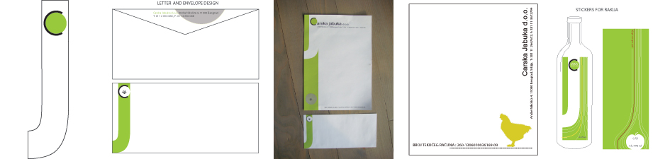
Carska Jabuka identity
Carska Jabuka
Designed: 2006
The capital letters “C” and “J” became main design force creating logo, visit cards, stickers for “Rakija” bottles or wrapping paper.
“C”- carska jabuka (from tsar) and “J”- jabuka (apple)
How to brand a brand new- young company in Vojvodina that do not want to be another etno village. We create a techno agriculture- a neo chicken are.